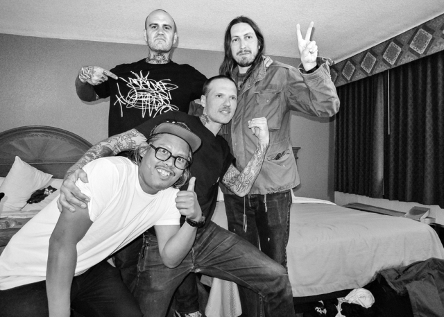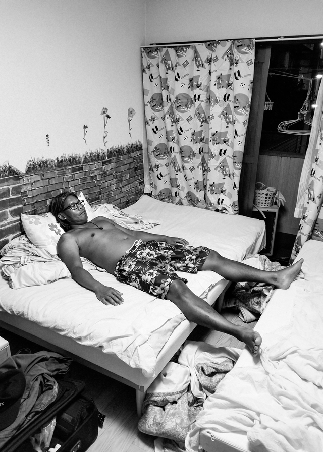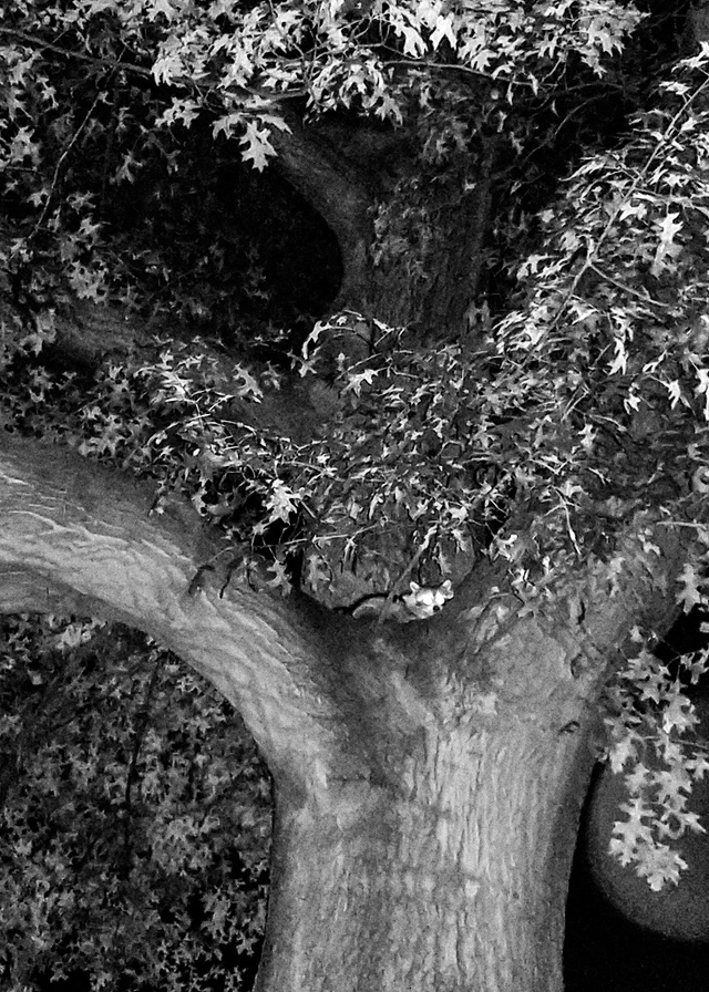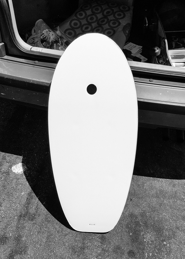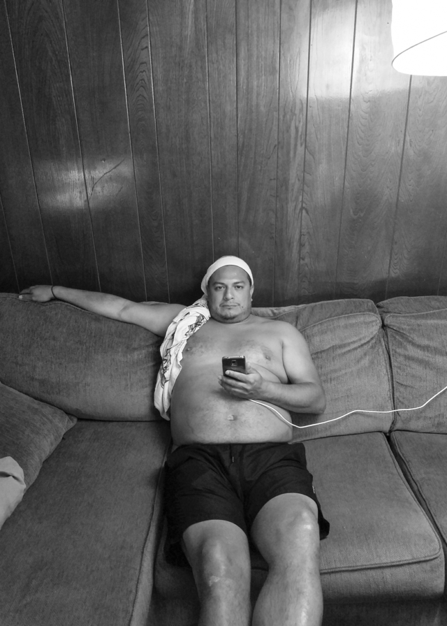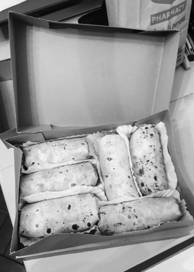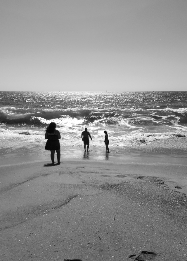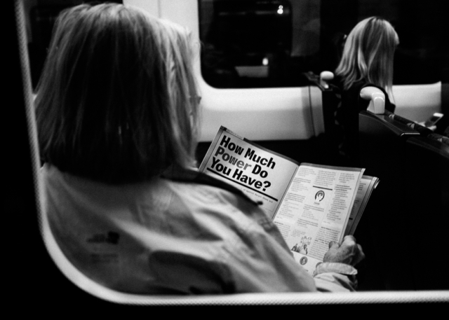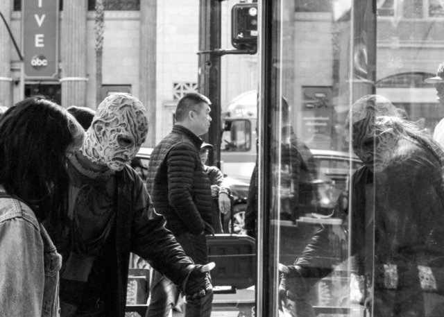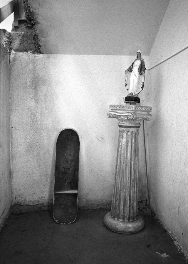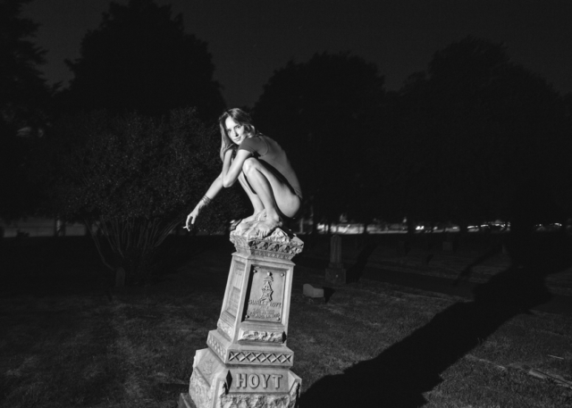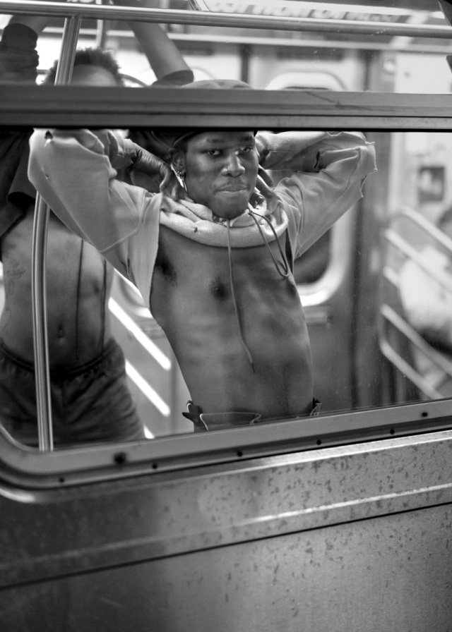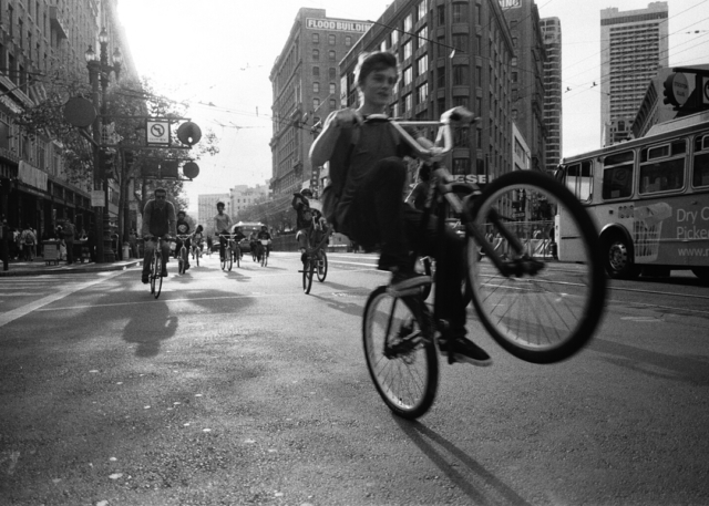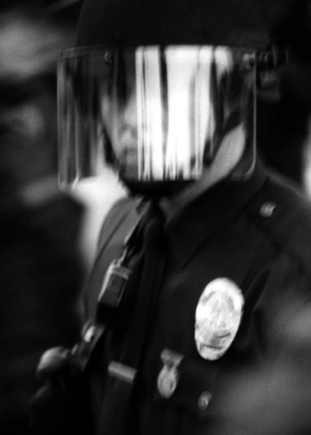
Did you buy my book yet? Here’s more previews to entice you..
Buy it here : http://shophamburgereyes.com
Photo Magazine
Did you buy my book yet? Here’s more previews to entice you..
Buy it here : http://shophamburgereyes.com
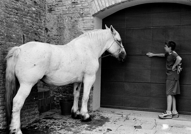
Photo by Michael Barolet
Meeting and trying to date girls was pretty rough pretty much the entire time I lived in San Francisco. So naturally I wanted to make a zine about it. I wanted to make a zine about all the joy and folly of being single. Some friends and I would come up with game show ideas and one of them was titled “Romance Warrior”. That seemed like a good title to steal for this zine. It ended up being a series of 3 issues.
These photos here are highlights from the second issue which was published in 2012. While it was supposed to be about “dating”, it started going the way of “nudes” and became increasingly difficult to find the narrative when editing the submissions. Which, by the way, all of a sudden got kind of out of control and the original concept got lost. Also not enough female perspective in the submissions to keep this series going. At one point I thought maybe I will just make it with my photos since it was my idea, but by that time the title already had a life of it’s own.
Anyways, it is fun to revisit these photos because I couldn’t post most of them on any social media. Let me know if you think we should bring this zine back. Now that Hamburger Eyes is all grown up, I feel like we can start playing with other projects again.
Photo by Lisa Weiss
Photo by Andrea Sonnenberg
Photo by Jesse Pollock
Photo by Ed Templeton
Photo by Alex Martinez
Photo by Michael Barolet
Photo by Ray Potes
Photo by Lisa Weiss
Photo by Dennis McGrath
Photo by Ruth Swanson
Photo by Ray Potes
They didn’t know each other at the time, but Michael Jang found a photo of Ted Pushinsky in his archives!
Just finished the layout of an 800 page book, the first real fatty we have put out. It is titled “Chrysalis” and it will be turned in to the printers tomorrow. Hopefully, it will be out by some time next week! These photos are some highlights and you can read more about it, the drama, the process, etc on my blog : http://raysreports.com
Photo by Elmo Tide
In continuing with previous chapters of Hamburger Eyes history, here are some highlights from the “Mankind” series. As as I wrote before, around 2010 and 2011 we started making a ton of zines. We couldn’t publish Hamburger Eyes the way we wanted to, so let’s just publish anything and start experimenting. In 2012 we got our glue machine, it is used to make what they call “perfect” binding. We wanted to do a zine over 100 pages and feature multiple photographers much like how we did when Hamburger Eyes was offset printed.
Photo by Brian David Stevens
When my brother moved to New York, I was half joking about how he should start a new black and white photo magazine and we cook up some story about a rivalry or falling out. Kind of like how one brother started Adidas shoe company and the other brother started Puma shoe company. But secretly we work together like Coke and Pepsi probably do.
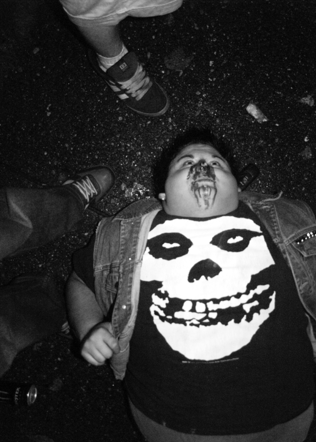
Photo by Zebulon Zang
He had a photo of an NY subway station that had a mural with a wave and “mankind” written in the tiles and I thought that would be a good title. He was into it. But he started talking about it as the east coast Hamburger Eyes and wanting it to be all about New York and I was like nah, Hamburger Eyes is world wide. Be world wide and let’s fake fight about it. I don’t think he liked that part of the idea.
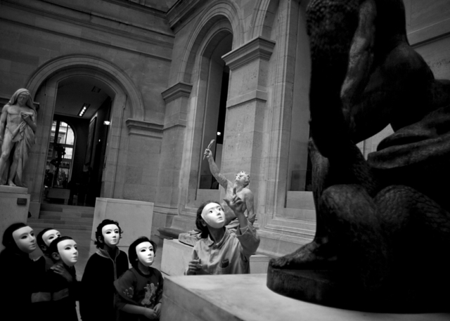
Photo by Peter McCoullough
That idea never happened. But I liked the title and decided to use it for this. Mankind was 120 pages and we did 3 issues. Probably about 100 copies each. After the 3rd issue is when people were like, why don’t you just call this Hamburger Eyes. Click here to read more about that.
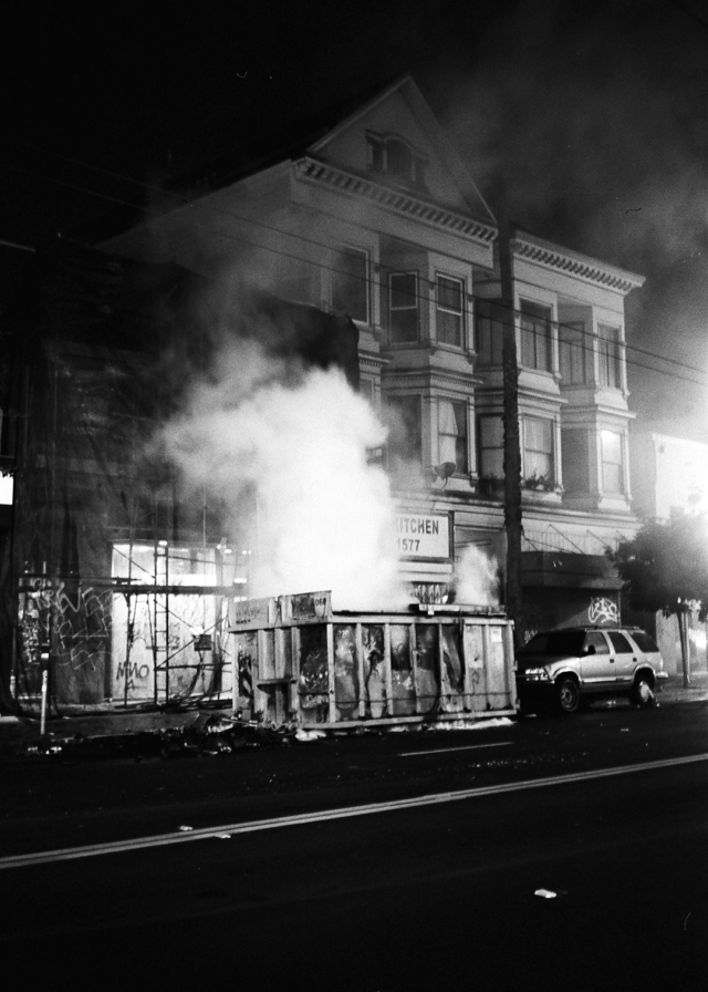
Photo by David Potes
Anyways, these photos here are a quick edit of some highlights. I remember I didn’t like how glossy my machine was printing the covers, so I would stink up the whole studio for days by spray painting a matte finish on them. By the second issue though, as well as a bunch of other experiments with other zines and books, I was getting the covers printed somewhere else.
Photo by Clay Kessack
Here are links to the original postings when they were released.
MANKIND No. 1
MANKIND No. 2
MANKIND No. 3
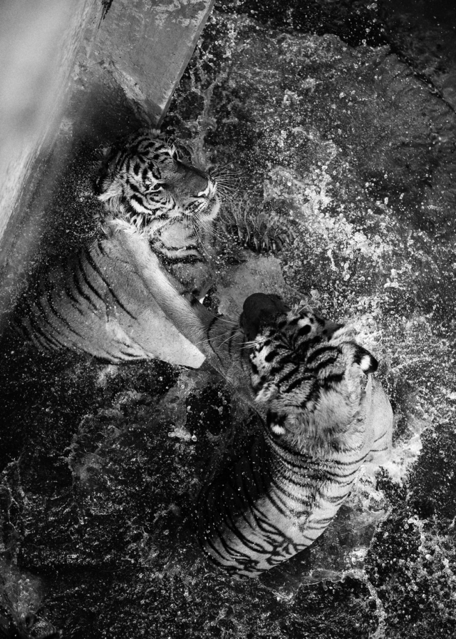
Photo by Brian Caissie
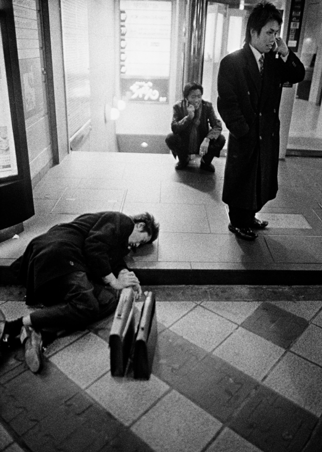
Photo by Guy Vinciguerra
Photo by Ray Potes
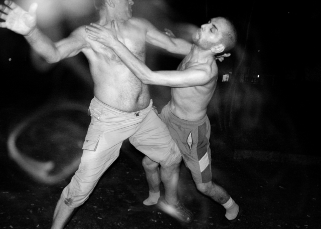
Photo by Piotr Pietrus
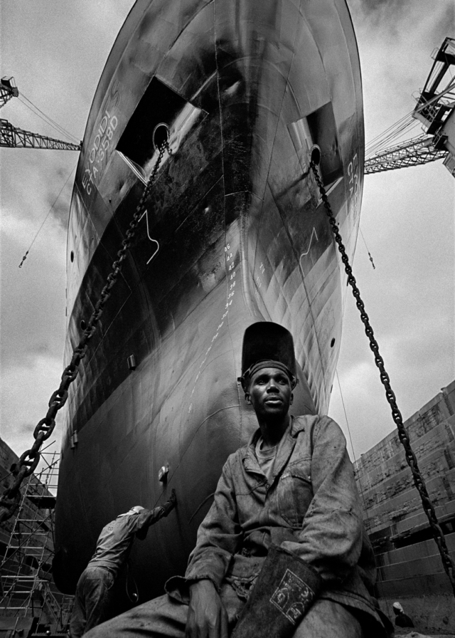
Photo by Jonnek Jonneksson
Photo by Dan Thompson
If you like posts like these, let us know if the comments.
Photo by Chris Leskovsek
More images from our latest issue. This one came out good. Click here to get it.
Photo by Joshua Zucker
Photo by Claudio Majorana
Photo by Troy Holden
Photo by Grant Lewandowski
Photo by Jud Muir
Photo by Robert A. Di Ieso
Photo by Joe Plonsker
Photo by Heather Williamson
Photos by Kappy. These are excerpts from a zine called “Basket Case”. I had an idea to do an online retail zine store, we tried it for a year or so. This store was called “Zine Kong” and we sold zines from all over the world. I wanted every order to come with free zines. I was hoping the publishers would include free zines, but instead I just published the free zines and added them to the orders. One of these zines was this one by Kappy. The site didn’t work because it needed lots more money and lots more time. Anyways, this post is not about that.
I was talking with Troy Holden the other day about his photos in our latest issue. He was tripping on seeing some of the photos in black and white because he had shot them in color. I said that, for me, once I make a photo in black and white, I try to just keep it in black and white for the rest of it’s life. But it got me thinking about a lot of things. So I just wanted to share some of these thoughts with you.
I learned photography in the traditional sense. I processed my own film and printed everything in a darkroom. You start learning from the past masters and you begin to honor the formats. Henri Cartier Bresson didn’t ever want his photos cropped. He composed his image with the frame of his viewfinder. He printed with the black border of the negative so that every one knew its not cropped. I imagine him and Robert Capa and other photo buddies getting drunk, making up Magnum Photo Agency and being like, “..And nobody will ever crop my photos again!..”. That’s how they started their crew, drinking wine all night. “Magnum” is the larger size measurement bottle of wine. I always joked that if it was started in the 90s, the crew would be called “40s” or “40 oz.”
It was a photo revolution and editors and art directors and designers now had to bow down and pay photographers properly and not crop photos. Square photos were printed square, everything was printed the sprockets holes and clips marks and frame numbers etc. Not everything but you get the idea. But newspapers and magazines still had their job to do, they still had columns and pages to fill and if your photo didn’t fit, they will find someone else’s photo that does fit.
So today I was thinking about page formats and publishing formats. Your photo is not the same size as any of the paper you will print it on. Sometimes I think this is why the 6×7 format was invented, for magazine pages. Added to the mix nowadays we have website formats, blog formats, and social media formats. Instagram even with all the crop tools is still best suited for square. Most of the internet is best suited for horizontal photos. And I think blogs, especially on phones or tablets, are best suited for vertical photos.
How do you deal with your photo formats of negatives, scans, digital photo files, cell phone files, etc? And then how do you deal with it’s possible corresponding display formats of work print, framed print, portfolio, website, blog, social media? “No rules but 1: no rules.” That was a lyric by my friends’ band called S.T.R.E.E.T.S. It was an acronym for “Skating Totally Rules Everything Else Totally Sucks.”
One day I went to a Robert Frank show. In this exhibit they had his proof sheets on display too. A couple of his most famous vertical photos, you could see in the proofs with crop markings, were originally shot horizontally. So if Robert Frank, the Godfather of black and white photography, can do whatever he wants then you can too.
I chose Kappy’s photos for this post because he doesn’t care. Actually, I can’t speak for him. But I don’t think he cares. He doesn’t have a computer or a camera. He shoots everything on his phone. He updates his IG in color and he makes his zines, Later Dudes, in black and white. He goes to Walgreen’s, sits down at one of those photo kiosk things, plugs in his phone and prints out hundreds of photos. He goes home and with scissors and tape and glue he makes the layout of his zine. And then he makes copies at Office Depot. It’s affordable.
When I shot film, I only shot black and white. I think I liked to process film more than I liked to print. These days, I shoot digital. Mostly my phone and then various cameras, I haven’t found the one yet, but every year I buy a new one and sell an old one. That’s for another post. I get my files into Photoshop and right away convert them all to black and white. Actually, that’s not all the way true. I do shoot things and keep them in color if I think they should stay in color. And I do shoot assignments that are meant to be published in color. I edit them ready for the largest print size I can make from it. They live on my hard drive like that and when it is time for a zine or a book or a wall or a website, I will then again re-size it for that particular project. On the other hand, sometimes I just want a quick update to my blog. Let’s see what’s on my phone and it gets uploaded with out any editing. And usually, those photos too will later end up converted and ready for action.
Anyways, I guess what I am trying to say is no need to be so rigid about formats, but think about style and work flow. I think it is somewhat important to think about these things. Your editing is your style. And there isn’t enough true style development these days. When I say editing, I mean Photoshop, cropping if needed, and choosing photos for particular formats and projects. No rules, but get loose and find out what you like, and make magic happen. And make sure your blog post titles are google friendly jk but for real.
Follow Kappy here : https://www.instagram.com/kappys_corner
Photos by Ted Pushinsky.
There she goes again. The woman in all black. I would see her everywhere, walking to the bus stop I assumed. A day or a month goes by, I see her again. Long straight gray white hair. 5 foot tall. Always black dress, black coat, black bag, black everything. Always by herself. Year after year I still see her and I still wonder about her.
One day at one of Ted’s photo show openings, I see him talking to a woman. They know each other well. Wait, it’s her! “Who is she, Ted?”, “She was my photo teacher.”
I don’t think I met her that night but eventually I did meet her and she is a very nice humble lady. I saw her last weekend at the memorial for Ted. She had a bag with her filled with books and zines by Ted. She shared them with people to check out. Some of those were ones that we published and one of those books was titled, “Facing It.”
She pulled it out and we chatted about how maybe we can do another publishing of this book. Or that someone should republish it. I flipped through it and I could see why. I was embarrassed. It was xeroxed and kind of falling apart. We had just gotten our glue bind machine and were still experimenting with sizes, page count, and different glues. Some glues dry soft so the bind opens more, some dry hard. Looks like she got one of the hard glue ones. This book was 120 pages and approx 5″ x 7″, published in 2013.
Earlier that day Troy Holden had mentioned his copy of that book falling apart too. But mostly because he had studied it so much.
When I held this woman’s copy, I had forgotten that every photo was a 2 page spread. Naturally you want your photos to fill the entire page and Ted shot mostly horizontal. You’ll notice most of his books are horizontal books with the binding on the left shorter side. Which is totally fine if you are a legit print shop and have the right equipment to do it. We didn’t. This is why the zines we printed with Ted are calendar style, staples on top, flipping the page up to see the next page. And this is why we made “Facing It” all 2 page spreads. The problem with 2 page spreads is that the middle of the photos gets lost a little in what they call “the gutter” which is where the page meets the glue meets the binding. It’s especially noticeable with smaller books. But once Ted’s mind is made up, then that is what is happening.
We were all fine with it at the time and it’s always fun working with Ted and we edited the photos to compensate for the gutter, but seeing this woman’s copy made me want to re-visit these images properly. So these photos here are some highlights.
After discussing the book I asked her if she really was Ted’s photo teacher. She said, “I was his photo teacher’s photo teacher.”
See more of Ted’s photos at his website : http://tedpushinsky.com
In 2010 was when we started the CATALOG. We had other zines and books going on besides Hamburger Eyes but it was time to get organized. We had the studio and some copy machines, couldn’t afford to put out the new Hamburger Eyes, so we just started cranking out zines.
We released the first 6 all at once. It was “Spies Like Us”, which was supposed to be all portraits of photographers but ended up portraits of civilians too, so a portrait zine. “Waterfall Hunters”, adventures in Hawaii. “World Champs”, the after party in the streets when the SF Giants won the championship. All photos by me. And then the first 3 volumes of Cellybrain, which was the best of a cell phone photo submissions blog we had running (before Instagram).
I felt like posting these photos today because of “street photography”. I never liked the term. I shot and still shoot photos of everything. I guess I just don’t like labels or categories. I do like black and white. I can claim that. I can see how it swerved that way though. Living in San Francisco with a big photo gang pretty much and mostly shooting all nutty street adventures back then only attracted all the crazy street photos from other major cities. But if you really look at all the pages of Hamburger Eyes, you will see that there is also the beach, portraiture, documentary, travel, landscapes, lifestyles, etc.
“The Continuing Story of Life on Earth”. That is the subtitle we still put on the credits page of each issue of Hamburger Eyes. Only a few people know this, I stole that. I took it from a National Geographic subscription ad. We stole a lot of things. When we had ads, we did a lot of trade ads. So you might have seen an ad in another magazine that said something like “Hamburger Eyes, an Instant Classic.” That was jacked from Kodak. “Imported from the Future” was one of my favorite ones. That was from a Nikon F5 ad. But the National Geographic one stuck. It summed it up perfect and I think deep down, maybe still, I wanted us to be the black and white version of that magazine.
Anyways, enjoy these photos of Hawaii. My parents moved there in the 90s so I would go there a lot and my brother, sister, and I would go “hunting”. The folks eventually moved back to San Diego, so there goes the free food, car, and couch.
Pretty sure the first 13 issues of Hamburger Eyes had at least 1 photo of Hawaii in there. And these scans are from 2010, so that’s why they look like that.
Why don’t they play poker in the jungle? Too many cheetahs. (Waikiki Zoo)
Let know in the comments if you like these back stories and behind the scenes stuff.
Photo by Kevin O’Meara
Highlights from Issue No. 31. If you don’t have this one yet, know that we will run out of copies soon.
Get one here : http://shophamburgereyes.com
Photo by Caleb Stein
Photo by Tom Souzer
Photo by Olivier Bekaert
Photo by Thatcher Keats
Photo by Joshua Zucker
It is not official yet, but the goal is always to find a cheaper spot to up our page count and up our circulation. Right now we are doing some tests with a new print shop. Every print shop has their own ways of doing things and this print shop needs us to beef up which means more photos from more photographers. WIN – WIN. If everything goes well the new issue will have 120 pages, 9 photographers, and an ISBN for distribution. Here’s an updated sneak peak.
Photo by Robert A. Di Ieso
Photo by Claudio Majorana
Photo by Troy Holden
Photo by Joshua Zucker
Photo by Robert A. Di Ieso
Photo by Claudio Majorana
Photo by Troy Holden